There has been a lot of comment about Open Sans and its usability. Here are a few experiments using Open Sans, Helvetica, Verdana and Calibri, with a few tweaks in spacing and the color of the background. I’m using only well-known sans-serif typefaces because, based on past dkos designs, the sans-serif look is what the design team seems to be after. You can post your own serif screen shots in the comments if you want :-D
Text from the front page of dkos earlier today. Images are hosted on flickr. Visit www.flickr.com/… for full-size images.
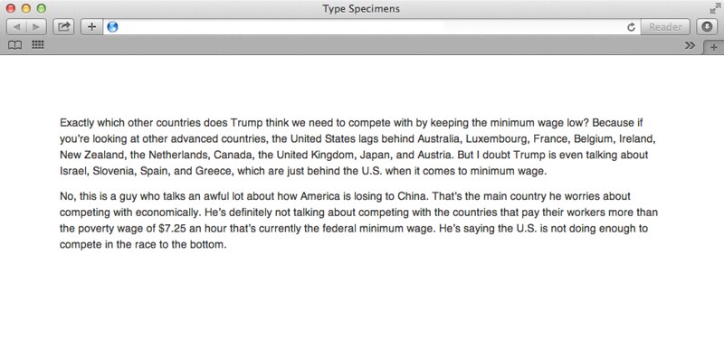
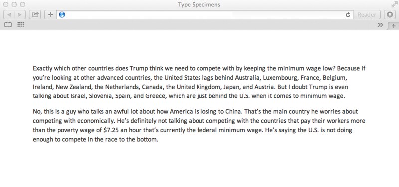
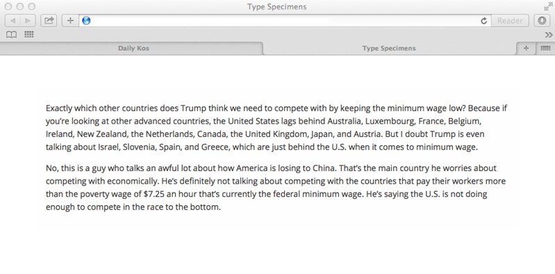 As close as I can get to the DK5 body type design (Open Sans 400, 14px, 1.6em line-height)
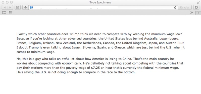
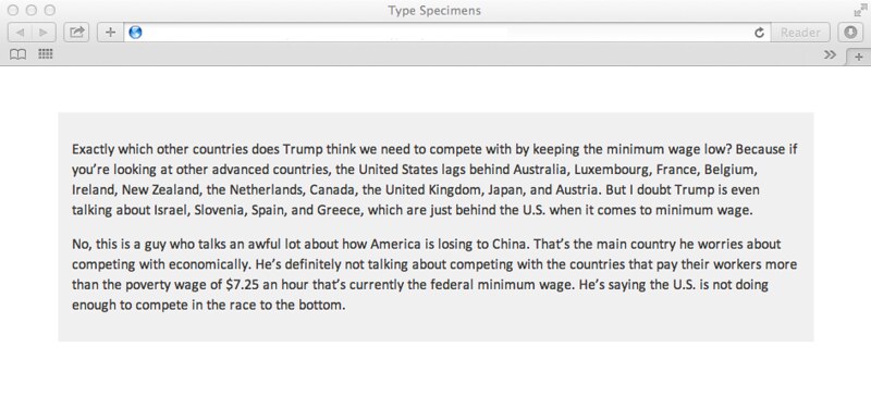
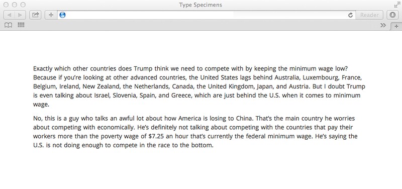 Slight changes to type design: 1.5em line-height and .1em word-spacing, .9em top/bottom margin on paragraphs
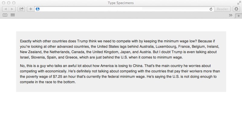
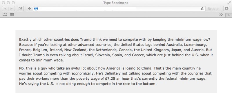
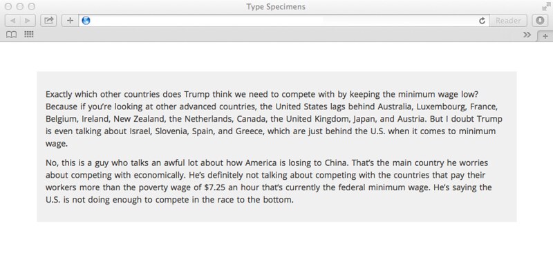 Same as Specimen 1a but with pale gray background
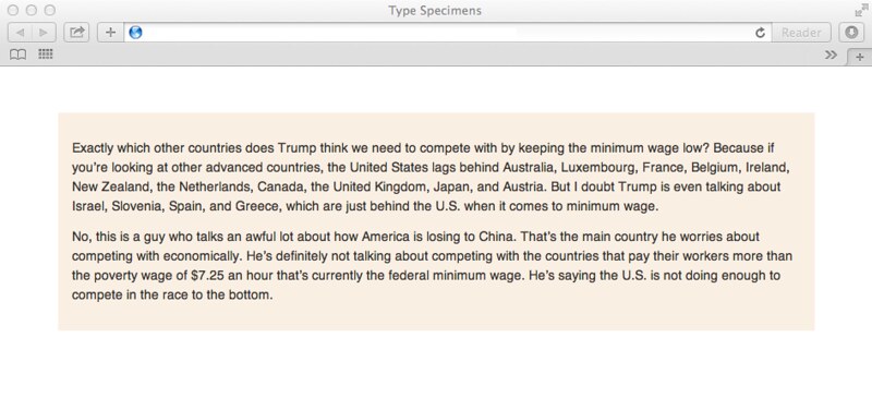
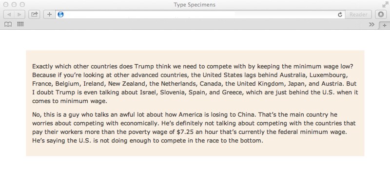
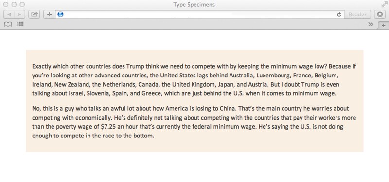
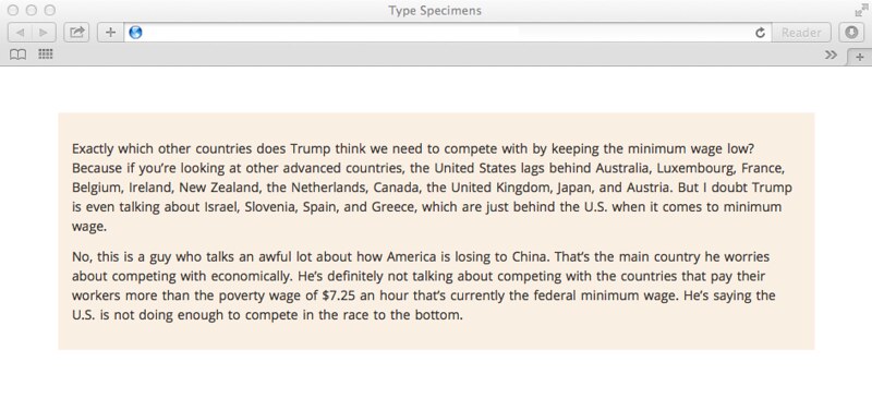 Same as Specimen 1a but with pale orange background
 Specimen 2: 14px Helvetica with 1.5em line-height, no word-spacing, .9em margin on top/bottom of paragraph
 Same as Specimen 2 but with pale gray background
 Same as Specimen 2 but with pale orange background
 Specimen 3: 14px Verdana, 1.5em line-height, no word-spacing, .9em margin on top/bottom of paragraphs
 Same as Specimen 3 but with pale gray background
 Same as Specimen 3 but with pale orange background
 Specimen 4: 16px Calibri, 1.4em line-height, no word-spacing, .9em margin top/bottom of paragraphs
 Same as Specimen 4 but with pale gray background
 Same as Specimen 4 but with pale orange background
I’m editing this diary on-the-fly since the WYSIWYG non-preview isn’t satisfactory for figuring out what I’ve got. Many apologies. If you are serious about evaluating the legibility, it is important to see the images at full-size (the type is TOO SMALL in the images, but I’m working within the limitations of image posting and hosting on flickr rather than using the image library).
Flicker: www.flickr.com/…
Here is a screen shot of DK4 (I think it is displaying at 100%; I cropped it to be the flicker 640 width). It’s sans-serif. Of course, I’m used to it because I read it nearly every day for a number of years. I think it is pretty easy to read. Of course, the measure of the column is narrower, which I think helps with legibility; the ratios work. For DK5 to work, with a different layout, the type is going to need some major tweaking!
 DK4 screen grab (at 100%). It was a narrower text column than DK5.

